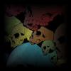
Joecore Posted December 30, 2011 Share Posted December 30, 2011 So, for future endeavors, this will be where I post images I derp in PS. This first post is dedicated to the idea of spicing up the livestream page - it's a little dull with just the black bars on either side, so I threw together some rough copies of potential backgrounds. At the time of creation, I didnt have the official GC font, but it's PS and anything is subject to change at anytime. I tried to stick to the Reaper/skull concept we got goin on, and this is what happened (PS - don't mind my dumb face in these... I needed a guideline to plan where the images needed placed):I have a few different colored versions of those skulls that aren't shown as well. Ok, now tell me what you think. I'm also open to suggestions/concepts/ideas/whatevers or if you have a cool image you'd like me to work in, I'm pretty flexible. I also do sigs on request, so yeah, theres that.Ok, flame away. Link to comment Share on other sites More sharing options...
Kevnvek Posted December 30, 2011 Share Posted December 30, 2011 Those are badass, excellent work. I'd say the first one would work best as the stream background, but the last is kinda cool in an artsy way too. I like the big skull guy on the right of the first two. Link to comment Share on other sites More sharing options...
green grenades Posted December 30, 2011 Share Posted December 30, 2011 last one is actually the best looking one. it reminds me of He Man for some reason. I don't like the first two because the two sides don't seem to match very well. The red one is okay but I just don't like red so that is just me. The fourth one is okay but just looks like a regular picture with a skull. So the last one is by far the most bad *** picture I've ever seen. Link to comment Share on other sites More sharing options...
Elite Effect (Jon) Posted December 30, 2011 Share Posted December 30, 2011 Ok, flame away.These are the worst POS I've ever seen! How dare you post these! (jk) They all look really good, I'm like Kevin though, the first one is the best for a stream channel. Awesome job. Link to comment Share on other sites More sharing options...
eminutia Posted December 30, 2011 Share Posted December 30, 2011 The last one is kinda funky, but the first two are jazz as well. Good job, you'll have to learn me how to draw some day lol Link to comment Share on other sites More sharing options...
Joecore Posted December 30, 2011 Author Share Posted December 30, 2011 Thanks for the feedback, everyone. Based on your recommendations, I've retooled the first and last layouts... This is how I envision the stream looking with either theme:I'm pretty happy with the way those look... MOAR FEEDBACKS, PUHLEEEEEEEEASE! Link to comment Share on other sites More sharing options...
PeeKnuckle Posted December 30, 2011 Share Posted December 30, 2011 I'd work within the JTV channel editor since we use JTV and not Twitch. I think having both sides match up is important. Depending on people's resolutions, the background image is going to look different.Good work, Joe.My vote: The first one with the left side mirrored over to the right. So there's a stack of skulls on both sides, along with our name.P.S. I did have a background image for the channel, but it refused to take it. I made the file size smaller, I changed file types. It just refused to take it. It was too bad ass for the channel. lol Link to comment Share on other sites More sharing options...
Joecore Posted December 30, 2011 Author Share Posted December 30, 2011 I didn't do anything from twitch, I just used the image as a layover so i knew where to put the images. The portion of those images that look like the channel won't be a part of the final image. And thank you for your input, I'll tweak #1 again to your specifications... I'll miss the creepy reaper tho Link to comment Share on other sites More sharing options...
Kevnvek Posted December 30, 2011 Share Posted December 30, 2011 That's just one person's vote though, you don't have to remove him. Though honestly it might look good with the multiple skulls the same on either side. I kinda like the big guy though. How did you make these, by the way? Use images of skulls, add effects, and touch them up, create them from scratch, or what?Also I wouldn't use the big reaper guy sideways in the logo above the cast like you have. Either the site logo we have now, or maybe the grouping of skulls in the grayish white, like the second mock up but without the colors. Link to comment Share on other sites More sharing options...
green grenades Posted December 30, 2011 Share Posted December 30, 2011 I'd work within the JTV channel editor since we use JTV and not Twitch. I think having both sides match up is important. Depending on people's resolutions, the background image is going to look different.Good work, Joe.My vote: The first one with the left side mirrored over to the right. So there's a stack of skulls on both sides, along with our name.P.S. I did have a background image for the channel, but it refused to take it. I made the file size smaller, I changed file types. It just refused to take it. It was too bad *** for the channel. loli agree with pk, the first one with the skulls mirrored would be best. i don't like the guy on the right side but i do like the skulls. i'd have them facing out though. Link to comment Share on other sites More sharing options...
Joecore Posted December 30, 2011 Author Share Posted December 30, 2011 That's just one person's vote though, you don't have to remove him. Though honestly it might look good with the multiple skulls the same on either side. I kinda like the big guy though. How did you make these, by the way? Use images of skulls, add effects, and touch them up, create them from scratch, or what?No worries. I didn't delete anything. And I make these by doing a little of everything you mentioned, aside from scratch work. I have an artists mind, but my hands don't know it...i agree with pk, the first one with the skulls mirrored would be best. i don't like the guy on the right side but i do like the skulls. i'd have them facing out though.If I face the skulls outward, it'll be more difficult to effectively place the text Anyways, here's the retweak of Theme #1 (now effectively Theme #6) - Pics of what it should look like on both Twitch.tv and Justin.tv. (Pay no mind to the underage vaginas in the JTV stream... I just needed a channel with a decent background that I could easily erase). Link to comment Share on other sites More sharing options...
PeeKnuckle Posted December 30, 2011 Share Posted December 30, 2011 I think it looks good, dude. I don't think it needs the words Gamercide, though. It's already said a few times inside of the channel. If they don't know where they are, they're clueless already. lol Link to comment Share on other sites More sharing options...
Kevnvek Posted December 30, 2011 Share Posted December 30, 2011 Yeah I think that one looks great. It's almost like the skulls are looking in and watching the cast. I agree about the text though. I was going to say have it only on one side, but it would look cleaner without it on either really. Link to comment Share on other sites More sharing options...
Joecore Posted December 30, 2011 Author Share Posted December 30, 2011 Retooled:Added the colored skulls theme (#5) to my personal page: Link to comment Share on other sites More sharing options...
Joecore Posted December 30, 2011 Author Share Posted December 30, 2011 Old Sigs (Even the bad ones!) Link to comment Share on other sites More sharing options...
PeeKnuckle Posted December 30, 2011 Share Posted December 30, 2011 Looks great, Joe. Link to comment Share on other sites More sharing options...
SycoYAFF Posted December 30, 2011 Share Posted December 30, 2011 It's nice to see another fellow graphic designer (is that term too official for us?) here on GC. It's been a LONG while since I've done anything in Photoshop, other than resizing and what not. But you have potential to do a lot more stuff man. Keep at it. Link to comment Share on other sites More sharing options...
Skylark95 Posted December 31, 2011 Share Posted December 31, 2011 These are awesome Joecore! Both of the Twitch tv pages turned out really well. Link to comment Share on other sites More sharing options...
Dateranoth Posted January 2, 2012 Share Posted January 2, 2012 Nice work Joe. I'm up for voting on which one to use for the page. If you want to start a poll with them in there we can see what happens. I'll post the picture with the most votes as our background on the channel. Link to comment Share on other sites More sharing options...
Joecore Posted January 3, 2012 Author Share Posted January 3, 2012 cool - i'll set that up tomorrow when i get home from work Link to comment Share on other sites More sharing options...
Sholtz Posted January 3, 2012 Share Posted January 3, 2012 those look really good man, I've noticed gamercide seems to attract many an artist Link to comment Share on other sites More sharing options...
Recommended Posts
Archived
This topic is now archived and is closed to further replies.